Fletcher Disability Consulting, LLC
Software: Illustrator, InDesign, Photoshop
Fletcher Disability Consulting, LLC works with organizations to create accessibility that moves beyond standard compliance. The owner and principal consultant, Melissa Fletcher, has over twenty years of experience advancing accessibility in education, nonprofit, and corporate environments. She is passionate about the work that she does and will help make the world a more equitable place
for everyone.
Melissa reached out to me to build the branding and visual identity. My focus was to create a friendly and legible logo that could be read by screen readers and had good contrast.
Building A Brief
When I met with Melissa, we discussed deliverables and direction for the branding. We agreed that contrast and screen reader friendliness was priority for the logo and typography/hierarchy. I showed her examples of current logos in the disability/access field and we talked about how we could build branding that was different and recognizable. She liked the idea of using an organic shape that could represent another aspect of accessibility.
Ideation & Iconography
In my initial ideation phase, I came up with these three icons that had motion and a slightly organic feel.


Access


Community


Equity
Logo and Color Palette
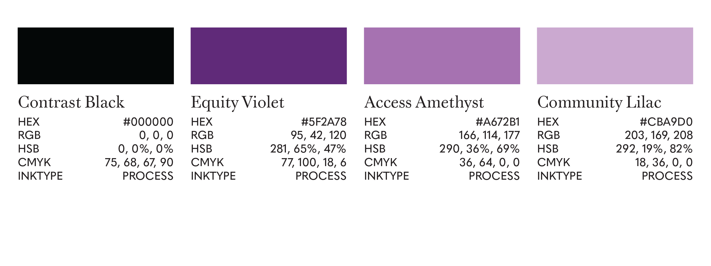
The primary logo is clean, friendly, and professional. It features the Equity icon and uses a monochromatic purple color palette. After choosing the primary logo, we made small revisions to the color palette and cut elements from a proposed logo to be a secondary logo. The typography and visual hierarchy of the logo informs the hierarchy to be used in branding/informational materials.